Friday, 10 February 2017

Repeat Pattern Experiment

Exploring into repeat patterns was an interesting one since there's so many ways to actually do it. I loved the idea of doing a repeat pattern via hand and paint, however the complications and much harder doing it hands on than it is on photoshop. Via photoshop you have a much easier platform and it's much quicker. My favourite point of call with photoshopping them is that you can brighten the colours and lighten the background making the overall composition crisp and unique. I went for red and blue due to the inspiration by William De Morgan and the way his paint and inks print onto the plates. His initial inspiration was Hyspanic and Italian designers which originally work with primary colours and a splash of green. 

The way you actually photoshop up a repeat pattern is simple. You make sure that none of the illustration is touching the sides of the square (it has to be square) and you flatten the image. After flattening you go to offset.

When you alter the ratio in offset, you are left with each corner flipped creating alternate sides which will later match up nicely creating that aspiration of repeat pattern. 
Then to create the repeat pattern, you copy and paste onto an even document and line up (or duplicate the layer). The one issue I had way that the outer sides didn't always match up leaving an annoying non matched side. However that isn't important if it isn't going to be repeated again.
This is the final look of the experiment. I love the way the colours contrast but the blue is heavier than the red which somewhat leaves it looking washed out because the reds so bright and bold despite being less of it. The outsides are uneven therefor if you were to repeat that finished design, they wouldn't match so that's something to consider and work out at a later date.

Tuesday, 31 January 2017

Home Comforts - Filling Space

The idea that people buy a blank canvas to do up, interests me vastly. They buy a blank space to put their own possessions in and fill the space with *typically* items and friends, that make them happy. This links in to the idea of how people fill their mind with comfortability to make everyday life that little more bearable. The "filling" comes with time and effort and I plan to illustrate what they do fill their space with.
Here's a few images from the internet of home, rooms, own spaces - of what people fill their spaces with.
Fury friends and tables


Indoor plants


IDEA'S FOR ILLUSTRATIONS

  • Basic illustrations of the items 
  • Pictures of items with illustrations on top 
  • People illustrations
  • Repeat patterns
  • Zine
Style/Artist influences
Cath K
The Cath Kidston designs are a favourite of mine because of their sometimes very intricate detail yet simplistic take and common house hold items made interesting. I'm not actually sure who designs them, I can't find it anywhere! I imagine there to be a warehouse full of floral designs and people in beautiful outfits with fairy lights, designing all the possible designs for their new season feels.


Tuesday, 24 January 2017

Richard Hamilton Inspiration (collages)

The technique used by Richard is something that I have been eager to try for a while, but with a little different edge on it. I have been interested in creating imagery that is photography x illustration, however this has a hint of it - it contains something quite similar of a technique. The background looks like it's from a magazine and is simply edited up on a photoshop document and then a circle placed over their faces. That is interesting to me because we typically recognise people from their faces and I would be interested in creating something that takes away that familiarity and ordinary way of recognition. Taking away somebody's immediate identity gives a sense of freedom to me - almost going completely incognito - which by theory, relates to my "what you fill the space" in your mind, with. The feeling of being completely comfortable.


These two are also a couple of favourites produced by Richard Hamilton. They are interesting because again, neither have their initial identity - both are face/headless. However, the right image completely interests me and relates to my idea in mind. The way the body is floating above the sea, almost in the clouds, creates a sense of freedom, yet contrasts slightly with the way the body is structured and is almost stiff looking. The right hand image makes me question, because immediately you don't see what it is (which as far as i can tell, its two people kissing.) The imagery looks found, especially since I do believe the behind image is a recognisable piece by Andy W. Both images are quite easily constructed - they could almost be done completely by hand, cut and stuck out.

Tuesday, 17 January 2017

Illustrated illuminated Medieval Manuscripts of Interest

SOURCE 1

Snail vs. Knight, from The Smithsfield Decretals, decretals of Gregory IX, Tolouse, c. 1300. Illuminations were added about forty years later in London.
Why did knives fight snails in illuminated manuscripts?
The truth is, nobody really knows for sure why snails are always fighting against knights in illuminated manuscripts. They are typically seen to be on the winning side of the fight and this has caused much speculation over why the knights always seem to be fighting snails:- 'the poor against oppressive aristocracy'; to ruin the reputation of the snail being a garden pet; even the ideal that it could be a symbolisation of the 'saucy female form.'

Rabbits killing men in The Smithfield Decretals, c. 1300

Long Neck, from Book Of Hours, England, early 14th century
 Dalmatian Sea Monster, an illustration by Poggio Bracciolini, added to a copy of Le Miroir du Monde, mid-15th century

Nürnberger Schemaart-Buch


Key Points William De Morgans way of working (Highly my inspiration)


How he created his tiles/ceramics:

"The original pattern was drawn onto paper and then traced onto very thin paper. Oxides and pigments were then painted onto the paper, this was then placed face down onto a bisque tile and brushed over with glaze and fired. This method was fraught with difficulties and depended on an exact firing to prevent lifting and blistering of the paper. However it must have been viable as many tiles were decorated in this way. "


"His use of Islamic Art as inspiration created some of his most intricate designs; he managed to reproduce the vibrant blues, greens and turquoise of Islamic pottery of the 15th and 16th centuries and re-discovered the sliver and copper lustre’s of ancient Hispanic pottery and Italian Majolica Ionic pottery  from Turkey is a prime example of his ability to capitalise on a source. In the 19th century Turkish pottery was collected by individuals and museums. His brilliance in design was matched by his knowledge of chemistry which enabled him to react to the results of firings and create a wide and exciting palette range."
ISLAMIC ART

ITALIAN MAJOLICA
IZNIK POTTERY
 "He had a great sense of humour shown in his tiles decorated with imaginary animals, influenced by his extensive knowledge of medieval illustrated manuscripts. The decorative handling of birds, fish and animals influenced many; Lewis Carroll used them in part of a decorative scheme at Christ Church College, Oxford."

"The sinuous use of line in his floral tiles relates to both Islamic and European Art, the influence of early medieval herbals with their simple line illustrations of plants can be clearly seen in his and Morris’s work. William De Morgan’s ability to re-work historical designs made him stand out as a designer. Using historical sources for inspiration was paramount in his development as a designer."


A Few More From Manc/Jai Redman

This is a piece by Jai Redman, an environmentalist artist. This is a painting (use of watercolour) and I find it really beautiful. It may just be just a leaf - but the way that if you weren't stood close it would just look like a leaf, interests me. I'm typically a real hater of all realism (because I think you can just take a photo of that and it's not very inventive) but when it comes to nature, I feel differently. Environmentalist Redman has opened my eyes and now I wanna do more nature paintings, damn.

These are some pressed fern leaves in the museum. I love the way that the leaves are all differently shaped and the detail within each section of it. I sadly didn't record where this one was from, but the difference between this one and the one below is significant considering they're classified as the exact same plant.

These final two from the museum conclude what my favourite pieces from the natural museum were. Look how pretty dried, pressed plants were and are. They inspire me to draw them and have inspired me to try out having my own version but in a sketchbook.

Wednesday, 11 January 2017

FILL THE SPACE IN YOUR MIND


This is a quick (just over an hour) composition I've created to kick start my thought process for this unit. The aim for the unit is to portray the idea of how we fill our confidence and our memories through-out life. We create space for people, so that they can fill the space. Filling the space we have in our days with tasks whether for pleasure or tasks he almost have no choice in. 
The quick composition was created by finding random imagery form the internet and almost none of them had any source to credit - however I have completely changed the images from their original state. A lot of colour replacement, duplicating and altering the opacity for the layers. Bettie Page is riding the leaf.

I would love to do more things like this. 

Tuesday, 3 January 2017

Life drawing (again)

Currently, this is the step I have taken when it comes to life drawing. I am experimenting with style when it comes to bog-standard-pencil because pencil is definitely not my strength. I decided to try just going for it; squiggly and experimental. The automatic style works well with keeping everything in proportion as you don't over-think what you're doing.
Again, this is the automatic experiment I'd completed.

Alongside the automatic style with pencil, I have decided that painting very automatically too grasps a better shape and comes with a more interesting outcome. Although less detailed, you can always build on top of the painting you're completing and you could go over with different colours (i.e) when trying out a different position.


A long term favourite of mine, is using pen (biro). You can experiment with the amount of depth you put on the paper by pressing down and you can get a lighter, more detailed angle on your work when pressing less-down. I feel as though pen flows much better than pencil.

This is the finished little 10 minute paintings competed with acrylic. Acrylic is good because you can add layers upon layers to your painting and it will blend out nicely. You can also go back to it later which I love, because it doesn't ruin it. I added white to the lighter sections but didn't blend - which actually looks rather effective. Darker sections took well with the red shade, because it wasn't too harsh yet it was distinguisable. 
This was my first attempt (sharpie) at doing this angle. OH my DAYS. I can't even begin to tell you how difficult I found it to proportion when the angle was so difficult to comprehend. The leg wasn't elongated enough, but as an initial attempt (considering I used the pencil measuring technique) I don't think it's overly terrible.


Wednesday, 14 December 2016

Study Skills - Essay Writing

Essay Structure
The best way to construct an essay is to follow your typical structure. The structure is quite easy to follow all things considered.
Here's a simple structure found on De Montfort Uni site:
Title
An essay title contains an explicit or implicit text. Therefore, after writing this, your essay should focus around this title.
Introduction
This should only be brief - the introduction should introduce briefly what is coming in the actual essay. What will your essay include and what will be your focus?
Main Body
Typically, you have 4-5 main topics in an essay. They should flow off of one another, you need to include your evidence, how does it fit into the title in question?
Conclusion
Remember, do not include any new material in this section. Summaries your ideas/argument, link back to the title and restate what you consider to be the main points. Some people like to make a rough conclusion before the actual conclusion.
REFERENCE LIST
- Publisher
- Page numbers
- In alphabetical order by surname


Thursday, 8 December 2016

Alternative Miss World initial research

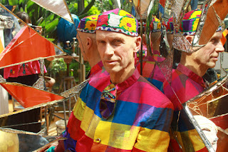
Alternative Miss World has been an on going 'beauty' pageant, challenging beauty ideals since 1972. Since 1972, it has changed a lot - it begun as a party-like event where people were free to do anything they wanted; including drugs and having sex wherever they'd like in the venue. However, since then it has kept it's chilled environment and it's excitement with the idea that anybody can take part and anybody can be whatever they'd like. The name "Alternative Miss World" was initially sued due to it's name being 'Miss World' - which referenced to Miss World and Barbie. However, they won the case with help from Tony Blaire. The show consists of a theme; a swimsuit, daytime and evening wear time - which the contestants are not allowed to rehearse prior to the show to keep the show complete raw. When AMW begun, it struggled to get going due to people not taking the concept seriously and they struggled to scrape enough money to start it, but the creator Andrew Logan kept it at his dream and it still stands today.
Andrew Logan


Logan was born in 1945 and studied at Oxford. He is a jewellery designer, a trained practitioner in Yoga (which in the Art Show of Yoga based in London, Logan presented the show.) Andrew Logan's family and friends are all very supportive and always have been, of Alternative Miss World - which as a consequence Logan's family and friends are regulars in the show and in the audience. Logans work has been shown in the Museum of Modern Art in Oxford and this man certainly is a man of many talents. 
Logan was said to have highly influenced Derek Jarman, which led Jarman to develop a film based documentary on the social scene surrounding Andrew Logan and his lifestyle - including his studio. The studio that Andrew Logan was once based in, was also once home to Vivienne Westwood.  Logan continues to host Alternative Miss World all around the world.

Bruegel Senior

Bruegel Senior was a Netherlandish Renaissance painter in 1559. He often painted, paintings which his father painted (around the same context, not paintings) and he was also a printmaker. Bruegel was born in 1525 and died roughly aged 44 in 1569. Bruegel showed complete interest in the Netherlandish Renaissance - often known for painting peasants with landscape elements and religious work and it was obvious that his interpretation was a vivid deception of life.
Netherlandish Proverbs is the name of the above paintings, although it was originally named 'The Blue Cloak.' The painting in itself has many, many meanings to the point of the very background of the painting having in-depth interpretation. This painting is classic Bruegel with his involvement of humans, objects, animals and the illustration of dutch language proverbs. The running theme for Bruegel is the continuous running absurdity and how he included again, the weirdness and foolishness of humans (which is obvious from the man with his bottom out in the window to the food on the roof.)
(Source: wiki)

Week 1 Life Drawing

The above paintings are during my first week of life drawing. I can remember first years life drawing class and very much enjoying it - but I don't remember the techniques fantastically therefore my first week back to life drawing wasn't overly ace. They're inaccurate (room for improvement) however, they do work and the use of paint is something I have missed. Acrylic paint worked well within these paintings, because you can quite simply catch light and dark very easily. My technique is the lighter the colour (yellow) is placed in the section where the skin is lit. The darker colour such as blue is where the dark areas are. The red is used for shadow and to show shape and form.

These are the sketches I produced in life drawing. They're not terrible and my accuracy isn't awful, but they aren't fantastic. Sketching is not my strong point - especially the body; however for a first attempt since 2014, I don't think it's awful. The breasts so far, is my favourite place to focus on. They always have a large surface area to try and grasp the shadows and where to place your lines. The mark making skills we used again this year are the thumb x pencil technique, which I used on these. The measuring of the thumb to chin, to see how many times it can fit into the human form is something interesting.

Finally, this is the paint on black paper. I really love the contrast of white on black paper - therefore the painting sits nicely. The back, I found very difficult to comprehensively paint; it has so many groves and angles and it's very hard to capture it well. However, for a first attempt I don't think this is awful. My painting style was quick and instantaneous and I tried not to focus on the actual style too much - rather the shape and form of the model.
Next week I want to try some different styles and go darker with pencil/charcole to show more shape and form on her body.