Tuesday, 8 November 2016

Flower Studies and Their Meanings

Victorian Language of Flowers
Pre-Raphaelites of the 19th cent.

The Poppy
In Rossetti's 'Lady Lilth', the poppy often meant imagination and eternal sleep. However, it also was said to represent pleasure - which is much how Rossetti wrote about Lilth in his literature. "The rose and poppy are her flowers; for where/is he not found, O Lilth, whom shed scent/ and soft - shed kisses and soft sleep snare?"


The Primrose
The primrose (depending on it's colour) had many conflicting meanings. Yellow, which was in Edwin Longs "The Daughter of our Empire", symbolised youth and young love.


Daffodils 
In Rossetti's painting "Veronica Veronese", the daffodils lay next to the scrap of sheet music with their sunny hues; daffodils typically meant unrequited love.


Violets
Ford Madox Brown painted "Convalescent, Portrait of an Artists Wife" of a lifeless looking lady all washed out. The lady painted is believed to be his wife, holding willed violets.
"Now that she is lying in bed thinned with the fever, she looked very pictorial and young as ever again."


Apple Blossoms
During Rossetti's "A Victorian of Fiammetta", the use of apple blossoms could mean good fortune. The romantic side created the symbolism for better things ahead, or preference.


Daises 
Millais was the first painter to paint Lizzie Siddal out of the pre-Raphaelite group. Millais painted the painting "Ophelia" (which is very recognisable in modern society), referenced from Shakespeare's 'Hamlet', which he gave her daises to symbolise the idea of innocence along side purity. It was said that daises could also represent farewells.


Hawthorn
"The Beguiling of Merlin", painted by Edward Burne-Jones; painted Hawthorns which were depicted to symbolise hope. However, along side hope it was said to also symbolise charm or magic.


Roses
A common symbolisation of the rose, is love and romance; which was earlier described by the victorians. However, depending on their colour, roses could also symbolise innocence of the love; white for purity to burgundy for an unconscious adoration. In Rossetti's "Study for Mariana", he used pink roses in a vase.


Honeysuckle
Within Rossetti's "Venus Verticordila", Honeysuckles were flourishing in the foreground, representing sweetness and the bond of love.


Other contemplations 
Lady Mary
Lady Mary was classified in the bible as somebody who was classed as pure. She had kept her 'virginity', yet god had gifted her the son of his - Jesus; therefore this flower is classed a representation of purity.

Lavender
Commonly used in the medieval age, Lavender was a way to depict who was a prostitute and who had availability.

Meanings
Forget-me-not
Remember me (Also my birth month flower.)
Snapdragon
Presumptuous
Bachelor Button
Anticipation (cornflower)
Yarrow
Good health

Western Art History
(Gothic, early/high renaissance)
White Lily
"Virginity"
Orchid
Jealousy, suspicious and deceit
Tulips
Death, prosperity, commerce, trade
The Rose
Mary's love of God
Lily
Purity
Iris
Regeneration/replenishment
Lavender
Desire, vices, loss of innocence,
(Medieval prostitutes, singled their availability etc)
Dandelion 
Innocence & nostalgia
Source: Historyofpainters.com

Hieronymus Bosch

All about Bosch
Bosch;s art was known for it's dream like surrealism; imagery and detailed landscapes. His illustrations of religion and narratives are some of his most famous works - and some of his most recognisable; primarily created out of oil paint and acrylic. During Bosch's lifetime, his art was collected in the Netherlands, Austria and Spain; yet his work is widely copied due his works popularity.

  • Bosch was born around 1450 and died in 1516; which we know of:-
  • His name was actually Jheronemous Bosch yet he later changed to Hieronymus.
  • He was a dutch painter
This was Bosch's most recognisable piece. It is named "The Garden of Earthly Rights" and is said to have over 100 meanings when looked closely into. On the right of the photo, you will see what we can depict as hell;
Hell is represented with fire, darkness, unearthly beings and something that resembles the blitz. Theres said to be reference to changelings within the picture (Changelings where the act of a body somewhat manifesting into something demonic and consequently resulting in death by being burned alive to rid of the demons within somebody.)
The centre is said to be 'Earthly Delights', which is busy; people being what could be interpreted as; shown around. There's people looking happy, there's people looking sad. There's a lot of details within the centre piece.
The left hand side is said to be The Garden Of Eden. The Garden Of Eden, in religious values; is meant to be pure and where we all started. It is said that TGOE is what people think heaven would be like. The best version of earth.


Tuesday, 18 October 2016

Trying to be cool with light and making box forts

This was an example of how I was trying to make a box fort. It felt as though I just couldn't get it big enough or I couldn't make it so you could feel comfortable enough. But, after a lot of contemplation, I came up with this one which was a pleasant size. 

The box fort that I ended up creating. The shape was practical - People can slide right in and feel somewhat comfortable (evidently if you're a lot taller than me, you probably won't be able to fit in. The box itself is sturdy - slightly pressed against the wall for extra structure. The light shon through the gaps where the edges didn't quite reach; the end was always having to be moved differently due to the length of your legs or how you was situated in that moment. This gave me an idea - the way light can reflect through a hole and make a shape onto the other side of the box just like in previous weeks:

So I had the idea to create something that would sit comfortable within a box where people can look in. A installation where you was able to look inside of the box and be mesmerised by the shapes inside of the dark, dingy box. For that to happen, I had to make sure there was no light getting in - which in itself was a challenge. I taped up all corners and anywhere there could've been light seeping through. I then taped a cylinder like shape, a little like the previous weeks where I have experimented with light in boxes, but it just didn't work. The final outcome was a little different, which I didn't get a photo of unfortunately. I placed my iPhone in the corner of the box (on the inside.) The phone shon multiple holes pierced within the card onto the other side of the box. However, that didn't do what I wanted it to do initially. 

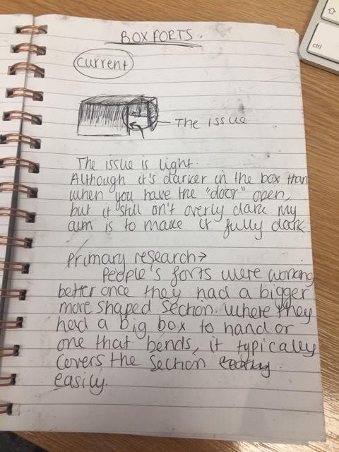
 To somewhat evaluate how it would work - I decided to very, very quickly sketch out the idea. This is just in my note pad because it was the closest too me; consequently resulting in a slightly better result. They may be difficult to understand to anybody else but it was just my way of brain storming it out; simple shapes.


Initially, I wanted something that spun, or covered the entire circumference of the box on the inside - but it just didn't work. I needed a brighter light, something thicker, something more sturdy and I just called it a day. It wasn't that I gave up, it was that I realised that this wasn't for me and I was no longer enjoying myself. Here's the box from the outside - which you can see by the excessive amount of gaffer tape, I taped it up good. It was hung on the sealing by two pieces of string. An unsuccessful experiment but I learned that it just wasn't for me and when something just isn't fun anymore, it isn't going to be your best work.

Manchester School Of Art


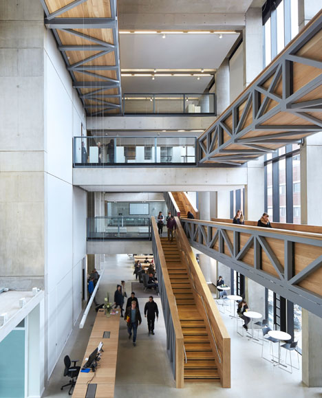
Last weekend, I visited Manchester School of Art. I didn't get much information on the actual studios because the studio tours messed up (on our behalf, we missed the tour) so I'm not much wiser on that. However, I did have a look around 2 studios which had open plan stairs and a hell of a lot of room in both. The "fine art" studio was very like North Notts set out their rooms during finals. They were all segregated into your own little section where you could mess around with materials and sketch etc, which I thought was nice for the fine art students. But the Illustration course is under Design and not art and it's in the above building. 
I loved the way the building is laid out, the campus in general felt very homely and I know that it would be number 1 decision if I get the chance to go. The campuses are 5 minutes walking distance, however there's also many scattered around the city. The only thing I wasn't keen on was that the other lecturer I spoke to was a complete arse. But the lady who is the other lecturer, was fantastic. So warm, welcoming and helped a lot with my questions! (plus, she was eating the best vegan sandwiches in the world which they sell in every building...)
They would like to see in a portfolio:

  • 20 Pages long
  • Observational and different types of drawing and media/My drawing abilities
  • Photos/photography
  • Graphics (such as info and scanned in imagery edited by myself.)
  • Artist research/in the style of with very critically written evaluations over the artists work and your own
  • It has to be nicely presented and thought through
  • Sketchbooks
  • Idea's and research (well recorded)
  • Processes for my ideas.
Within the course you can do anything; first year is about observing the city; creating flip books/drawings/editorial photography etc. They encourage the use of lots of different media.

Leeds College Of Art

I visited LCOA and I wasn't too sure on how I would like. As much as I love the over-all city, I had never seen or known first hand what LCOA is like, so I figured my best bet would be to visit the university. 
I caught the train, which was simple enough and I have done quite a few times so that wasn't necceserily a problem. However, the actual trek from the centre of Leeds was quite a while away. Strangely enough, even university in Leeds come's before LCOA. 
The facilities were great; you had complete access to the university facilities on both this campus and their other LCOA with the other access to the other universities also. Plus, they're merging soon with Uni Of which sounded like it was to become an even more interesting university to attend. The rooms were large and of all art variety; each block had their own shop containing all the materials they could wish for at a discounted price for students due to the students having a discount card. The rooms that particularly stood out to me, were the screen printing rooms (where you had a somewhat dark room inside where you had to wear a gas mask and protective gear to develop your piece of art.), the textile room was pretty exciting with how much space and interesting textures they had and I loved their computers where they had specific settings to be set where you're able to see the image you have made, in the exact colours it would be printed out in. 

However, I didn't like how far away it was; how the lady who took me around said that there were only 2 student housing near the building/in the area and then the rest were anywhere up to half an hour to an hour, bus journey away and that just doesn't appeal to me. 

I wasn't told the over-all Illustration spec, however you're able to read that up on the course spec online. The course seems to be based primarily around illustration and developing your skills within the illustrative business, which is a good plan. However, I would like also, to have a lot of experimental time too! Luckily, the lady did state that we have the ability to go into any room (sometimes you may have to book) at any time and try out all their facilities which is nice. Also, she stated that you always had help on hand by each blocks technicians, which is always a good addition since a lot of the machinery and the other facilities she showed me, I had not used before.


Dada Notes 2 - Gaga for Dada


Notes from my sketchbook:
Dada influenced many different types of modern culture. With that in mind, the main influenced parts of modern cultures would potentially be; punk, Monty Python (tv shows), Damian Hurst (artists), shooting stars (another TV show) and the mischievousness of peoples way of working now. The dada movement started 100 Years ago in Zurich, Sweden when a man named Hugo Ball and Emmy Hennings opened a Cabaret Voltaire in promise to bring more business for the owner - by selling more sausages and beer. This was in the early year of 1916 during the world war, where many people were finding solidarity in countries such as Sweden and America, who wasn't yet involved in the World War.
In the Cabaret Voltaire, many people attended and they were all very interested in the escapism which was led through performance art, song and dance. However, it shortly went bitter after Hugo Ball began chanting "gagji beri bomb giandridi laua looni cadoria" an ancient ritual which he believe made him fall into a trance. "Katangi te tivi kivi ka tangi tem mono". Many people didn't like what the Cabaret Voltaire had turned into which shortly lead the Cabaret to be closed down; due to the lack of attendances consequently leading Hugo Ball into a lack of cash where he couldn't pay the rent.

"Da da is a new tendency in art..."
The attendees of the Cabaret were sometimes notorious artists; performance, singers and general artists. 

The dada artist did very mischievous acts such as; sending in a false news article where it was actually published. To summarise - Dada was an experimental, short movement which later lead the surrealism which is also very influential in the art we see today!

ARTISTS INFLUENCED 

CORNELIA PARKER - This is "Dark Matter" which was in the style of Dada's collages turned into a big installation which made the views also a part of the art work. She literally blew up a shed and placed it together around lights, therefore implementing the somewhat reckless attitude Dadaism somewhat portrayed.

TRACEY EMIN - This is "My Bed" by Emin. The influences are pretty obvious; the way it's so out of the ordinary, fresh and made from found objects, which is a direct influence from Dadaism.
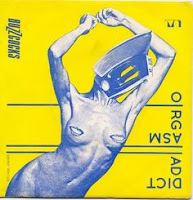
PUNK - All the punk scene had very cut up, collage typed, DIY song covers - here's an example of a few:


DAVID CAMERON CUT UPS - The interesting pieces of music people have created of cut ups from media. Somewhat like the collages, but rather than paper cut up, it's sound.

Video installation with Darren (potential placings)


109 - This is the first place I thought of when given the potential idea. I thought that, potentially you could plus in the projector next to the mac (move the mac out the way due to it being in the way) and project the video into the little white section where the window is. However, the problem would be there light pollution - but that could be easily solved by coving said windows.

2D - People have used this placing before since it's a good option when it comes to light pollution and the multiple sources for electricity. The placing is particularly a good spot for video installation, because it is projected onto the wall directly across from it and you can experiment with height. The lights can be turned off, therefore you have the opportunity for it to be pitch black and the walls blank so you don't have any form of inconveniences with peoples art on the wall.
 2D - As an over-all composition, it would be relatively dissatisfying unless you move a lot of inconveniences and interruptions. However, all things considered; the wall would be an interesting space to project said video. It's a slim wall, which is a little different considering most are projected onto a big wall with a wide space. The electricity source has a good placing, since there's 2 plugs right round the corner, however you may need an extension cable to project it since the actual lead from the object you're plugging in may be at an inconvenience since it's placed awkwardly around the wall.
This is a little bit of a long shot, but if you was feeling ultimately experimental - you could create an installation along side the projection. The projection would work since there's electrical sources right at the back of the room and then there isn't any light pollution when the lights are turned off, also. You could hypothetically place an object into this space, or create a hanging sculpture/installation into this space which the installation would be projected onto. There's only the one downside - this is that there may be other people wanting the space since you're taking up a large amount of 2D.


Thursday, 13 October 2016

Short Thursday

I haven't experimented with pen in a while, so to get into the swing of things I tried using a biro and just sketching and working in with light and dark. This was under the theme of how I feel. Panicky, worried and very insignificant, hence the hand through face little doodle there.

Heres a little graphics I did. I haven't experimented with graphics in a long time, so I thought I'd just throw something together to get my rusty skills into the swing of things again. The writings say "am I an artist yet?" because I'm super panicy and don't feel like I am creating enough.

Very quick sketchbook work to throw some paint in there and try out doodling again. Over the summer I didn't get much done, therefore the only option being to throw shit together to get the clogs turning again.

Wednesday, 12 October 2016

Collage

As our typical Thursday arose, I wanted to create something that was meaningful. Something that was different, experimental and different from others work. I picked a topic I'm passionate about; equality; and got right to work. The above image is my final spare time collage which was really interesting to make. Within it's composition of found imagery (which correlates with the ideal of the recklessness within dadaism.), there's botanical artwork, Donald Trumps mouth (which is a big fuck you because the filth against females and races, is exactly whats wrong with the world), a porn image from 1970 because it was ultimately taboo to be open about your sexuality - until the movement arose and in the 1970's and 80's, people became more open which I think is a massive break through. Some knickers, another porn image, some modern day legs from a commercial that I spotted on the side of an add bar - I made it black and white to fit the over-all feel of the composition. Bettie Page, because she was a strong female in history; A tree - because the tree of life is a brilliant form of symbolism. The rabbits and Obama make the over-all questionability of the collage even better. He was a great leader and for America to even consider giving his role to a sexist, racist bloke, is beyond me. Oh, not forgetting the leaves over the vagina as public hair - just because, really. Well, because of how natural the vagina etc is and we should all appreciate our lower areas by doing whatever we want to do with them!


Here's some abstract flowers I painted. I love the idea of using your finger, something that has grown just like a flower has, to create something so similar. I don't especially like how it is on the green paper, though, but this was a 2 minute experiment to see how things could go into one-another. I love how the colours, rather than mixing, just sit comfortably on top of one another. They look really pleasant and they somewhat look like a fire - to me anyway.

I don't know what to say about this, really. Here is something I literally through together in a moment to see how it could turn out. The idea behind this was to show somehow, a way of putting light through paper, or showing an image behind strips. But, as I got a little through the experiment, I had another idea - one that I felt was more worth while and would look (over-all) a lot better.

Here's a cool cock. No, really. This experiment lead to many different components - which I love. I tried to somewhat colour coordinate all the way through, with stereotypes being thrown together - the natural ideal thrown in there too; all the taboo imagery and a few comments people say. This penis was a seconds worth of art that I loved. The "Cool" cutting was from a 'Now Then' Sheffield magazine which I really do love how the red contrasts with the blue and pinky/purple. It's made out of tissue paper with nothing else but tape and a stem leading into it. It was a lot smaller in person, which I thought would be a lovely little addition to a large over-all composition. 

This is a little image of my collage printed and behind some stems and leaves. Natural. I'm getting tired of repeating myself, but you get the gist. The whole idea that our bodies should be taboo or that somebody can have an adverse effect due to their narrow minded opinion or level of authority in the system, is beyond me and something I get very passionate about.  

A little closeup of my imagery. It's so much fun creating lots of little detailed images out of found and edited images. The above image (because I have previously explained obama) is all made from Now Then mag. It was created for any purpose other than to get me all warmed up to create some hella meaningful art. So, that's where it all started.

This is the over-all composition. It was set up in literally 3 seconds; it's attached by the skin of it's teeth and it fell down quite suddenly after taking a photo - but here it is. Majorly DIY, very Dada yet post punk feminism. I tried to bring everything together and I didn't want it to look flat or generic. The leaves and stems add a lot of character to the piece and I personally feel like it it worked well if I fixed it on properly in a better space. The Mes on Scene really was not my speciality that week since there's lots of objects around it that aren't part of the piece. 

A little addition to the piece were some hand painted, acrylic paint breasts with leaves as nipples. If you haven't understood yet - the whole idea that our bodies are as natural as nature that we walk past daily, is why there are plants coming through where nipples should be. Nipples are probably the most unnecessary taboo subject in 2016. Luckily we have public figures that are speaking up and movement's such as 'free the nipple.'

All the tiny detailing (such as this) are flowers crossed with nipples. I love, love, love how the paint glides together when you layer it like a collage. The use of your finger just makes it better because you can see the texture created. Using your pinkie is so delicate yet the mark making, to me, is the best part. The way the colours run into each other, yet if you dab it, it sit's perfectly above it.

Tanya Vyguzov
These are two piece's by Tanya Vyguzov. They inspired my little collage which later lead to the final of the day, because I loved the contrast between actual imagery and the very graphic styled work. I love the discolouration in parts with the contrast with the somewhat washed out colours. However, I think it would work better if Tanya added a completely contrast colour - They somewhat seem coordinated (accidental or not) which I felt wasn't going to work for me.

Tanya Vyguzov typically uses the colours red, blue and yellow/black with all kind of variants depending on the piece (which you can tell between the two images above. Vyguzov also has completely different pieces of collages, but I didn't think they would be relevant at this particular time. I'm not a fan on the lips on the above one; I think they could be of a different, less cliched colour to make it more interesting, but over-all I love the simplicity.