Wednesday, 30 November 2016

Study Skills, Plagiarism, Copyright, IP

Study skills are essential for passing a course or anything based around studying. Studying is typically an important part of a course and the skills included when you want to successfully study are;
  • Time Management 
You can improve your time management by creating to-do list's which gives you a steady but sure list of what you need to do and when by. Getting up and making your classes/getting up and completing parts of your to-do list is also very important. However, despite having to study, you also need to be able to have 'me' time to rest your mind and do the other parts of your life, which is very important. Sometimes it's a good idea to reward yourself after you have completed something or many parts of your list/what you need to do, so that it isn't just all work.
  • Note Taking
Note taking is typically an important part of studying because then you aren't under the illusion that you have to do something or you do something wrong - because this could be time consuming and divert your attention to the wrong part of the study basis. Re-writing your notes after note taking can be important because you may run the risk of being too blunt and when you go back to look at it in time, you may misinterpret or you may not be able to understand your notes.
  • Reading
Whether reading is a part of literature that you have to study for a certain unit or whether it's research to back up your art - reading can be important for your course. Typically, reading is something you will end up doing at some point if not consistently throughout your year; therefore to successfully read and take in the information, always take notes of the important parts and the relevance. Always putting a source on your blog after writing information taking from something you've read is important; especially if you want to go back and re-read something or if you miss a part off. It also covers your back incase the examiner thinks that said writing is entirely your own which could result in it not being included when you are assessed. 

Plagiarism
"The practice of taking someone else's work or ideas and passing them off as one's own" 
(Source: Google search)
Plagiarism could apply if you are copying something word-for-word or if somebody was to use a section of text and if they use a similar way of wording with very minor differences; it is still classified as plagiarism. 
An example of this: 
Led Zeppelin were sued for using a riff that had an almost identical riff in their "Stairway to Heaven" as Spirit's "Taurus". The consequences of plagiarism is that you could be sued, or asked to change said part of their song (etc) and they would have no choice to do so. Sometimes you could be sued for a lot of money and have no choice but to pay it out.

Copyright

"The exclusive and assignable legal right, given to the originator for a fixed number of years, to print, publish, perform, film, or record literary, artistic, or musical material."
(Source: Google search)
Copyright exist to protect an author, a band and their name, songs, artwork etc. If copyright didn't exist, the more famous bands may have 100's of other following bands with the same name; or a book could be copied word for word and somebody else could put their name on it too. 
In the UK, you could face a penalty of 6 months imprisonment from the Magistrates Court; or they may be charged anywhere up to £50,000.

An example of copyright is:
Tuesday Bassen (a small illustrator) - her work was used without crediting her or paying/ or even permission by Zara and a few other big named brands.


IPR
"Intellectual property (IP) refers to creations of the mind, such as inventions; literary and artistic works; designs; and symbols, names and images used in commerce."
(Source: Google search)
What your intellectual property rights are:
  • The names of your products or brands
  • Your work
  • The design or look of your products
  • Things your write, make or produce
It may be covered through copyright, a patent or a design if it meets a requirement or if you have a logo that is copyrighted and is distinctive. If you are self-employed, commissioned work sometimes falls under your intellectual property because it is their work for you unless your contract gives them rights.
(Source:Gov Site)

More thursday experiments


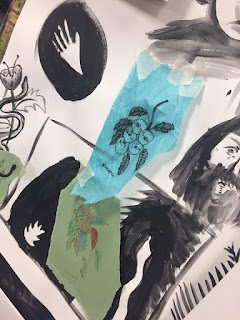
 My aim by combining ink and my fine line work was to put a spin on what I usually do. My love for doing lifework is something else; which I have done for a lot of the time I have been drawing. However, I feel like it's getting to a point where I'm finalising how I do my line work and needed to potentially mix it up a bit. Therefore, my theory was to add ink to my designs. But before I get into that, this is the above images of the lifework before the ink. It's so neat and I find it so satisfying. I kept swapping between 0.5mm and 0.05mm to do these to give it the perfect ratio of thickness.


Here's a close up of my little illustrations with the bright, vibrant blue ink behind them. The technique is literally paint brush, a little water and a lot of painting! It's almost impossible (or I found it) to paint the background evenly because the ink dry's differently each time. It really does spice things up a bit and definitely puts a spin on my original designs! I think I'll use this design basis in the future.

To summeries, this is the work pages in my sketchbook. Although most of my sketchbook work is not on my blog because i'd be here forever; but these are it. They're super lovely and I really enjoyed completing them. However, I think they'd be better compositionally if it was planned out and on a large scale. The left hand page is biro and ink - just because I had the ultimate urge to get creative and do a few different kind of designs/materials when it comes to ink/biro/fine.

Thursday, 24 November 2016

Personal Statement.

I am currently a student at North Notts College, studying an Art and Design Foundation course. I enjoy the course because of flexibility and how you have the opportunity to thoroughly explore styles. The exploration required through the course led me to where I am now and was a big influence on how I found out illustration was for me. The way the course has led me, I found that I get a lot of my inspiration from the music I listen too, since most are artists along side their music. The musicians I am interested in (such as Keaton Henson) have a distinctive style with their music, which usually coincides with their artwork. Henson's hesitant artwork particularly interests me due to his quality of lines and the way he mixes his love for illustration with his installations. Another favourite of mine is David Shrigley. Shrigley has a similar feel to Henson (with his childlike way of working) however, his humorous take on the style makes it that more unique. I like that you can see Shrigley's work so frequent in shops as opposed to just museums, due to them  often being printed onto everyday items.
I have been visiting museums long before I knew it would influence me like it does today. My interest for museums and seeing art in the 'flesh' came from the frequent visits to places such as our local Millennium gallery in Sheffield, which later led me to places such as the V&A. This consequently instigated my curiosity into different art movements and styles very early on. My love for botanics for example, came from visiting The British Museum and seeing William De Morgans work in person. My favourite part of De Morgan's work is how he found the perfect balance between intricacy and simplicity. The simple designs are often met with the intricate pattern work behind it, making his work very eye-catching which I like to take high influence from. I have recently been experimenting with printmaking, which I love to add an intricate pattern or detail on top of the hand printed imagery, giving a similar effect to De Morgans tiles.
I love illustration and the process that comes with it. The idea development behind illustration and how you come about your illustrations interests me because of the exploration involved and I really enjoy that there's always something new to discover in the world that will influence your art. Sketching automatically when being on my travels develops my work. It's crucial to my personal development because the automatic sketches and travelling helps expand and change my ideas and influences me in a different way each trip I take. During my previous course in Art and Design, we were set a task where we had to work on a commission for the new bus station which entailed work for the frosting on the windows. I particularly found that this was one point in my journey to finding which art form was most interesting to me, because of the exploration into different styles and different ways of working. Keeping to a brief for a genuine (non hypothetical) client was an exciting step to accomplish, because you knew the end result was going to be something that was seen by many. I have previously worked in demanding restaurants and it felt quite similar; keeping to expectations and maintaining a high level of consistent work throughout so that you keep the client and yourself, happy. The sense of achievement when the final product was up for all to see, was extremely exciting.
I want to study illustration at a higher level because I think it would help me expand and stylise my work through meeting professionals and exploring more facilities so I can keep progressing with my art. I would really like the opportunity to meet other fellow artists who have been through every step that I am taking and hear how they got to where they are now. I am looking forwards to the challenge that progressing onto a higher level will bring and I am very excited to hear from you.

Gnomes and their deeper demeanour

Gnomes were originally based off of the mystic ideology that little men lived underneath the ground. Some magicians and other spiritualists; commonly considered gnomes to be very important elemental spirits to earth (the others being water, fire and air.) It was said that gnomes had the ability to travel along the earth as easily as humans, but if hit with sunlight; were turned to stone. (source: justsaygnome.com)


Cinematography

Film is used widely across all platforms; whether that's a music video; a installation; TV shows; youtube etc. The primary area that I'm interested in is the cinematography/actual objects inside of the video itself. For an example; Sophie Harris-Taylor who creates beautiful cold toned imagery.

Sin Eater T1

This is a piece by Sin Eater. Here's Sin Eaters self proclaimed life:
"Sin-Eater lives deep in the heart of Herefordshire’s countryside.Here his fascination of animal forms grew & gave birth to his passions for the collecting of taxidermy & theory of evolution.A cynic of photoshop all of his artwork is created by hand.His desire is for Sin-eater to belong among the Albrecht Durer’s. Detached from the contemporary Sin-eaters work is a call into the echoing chasms of the past."
This particular piece is on lots of items that Sin Eater has created. I adore the intricacy and to know that he does it all by hand is astonishing. I aspire to do everything so intricate and always have done, which is why Sin Eaters work particularly stuck out for me. I love that Sin Eater does botanical art combined with animals yet also incorporates skeletal pieces and somewhat dream like fantasies. 


This was the first ceramic piece I saw that SE had created. I adore that his wife(?) creates crockery and that he is able to draw onto the hand made pieces. They look so delicate and definitely delicate. I would like to create my own crockery piece.
Another one of SE's little drawings on a mug. It's so beautiful; it looks so raw and looks as if it could've been dug up from the ground, again fitting in with his personal style that's so intricate. I don't think that Sin Eater personally consecutively draws onto the cups himself - but this is beautiful non-the less.

I think it's a much more intricate version of Keaton Henson's work on crockery. Keaton also creates art on mugs and cups and dishes etc - which I find very interesting. This is a photo of the mugs, which you can see how hand created the mugs are by the difference in colour throughout them. I definitely want to illustrate on some form of crockery at some point.

Messy automatic Thursday

This was my work space at the end of the day. I was basically spending the whole day trying to work out what to draw, which ended up with lots and lots of different types of doodles including my usual botanics, humans and some snakes. Some of the doodles included quite fine, controlled work - other parts were very messy and very automatic.

This is my very neat little hand holding a snake. I have seen a lot of the black-out snakes at the moment (with being so interested in the tattoo industry in my spare time) and they really do interest me. I like the way that with a snake, you can do it lots of different shapes and the way you can incorporate them into almost any image because they can be so flexible in real life that they fit with almost any composition.

My onesie snake dude. Again, with the snakes (but I really do think they look good in any image.) This little controlled fine liner doodle, is one of my favourites. I doodled it onto tracing paper so I could place other more bold doodles behind it and they will show through so I could experiment with the way they sit and the composition. The little guy is quite detailed and theres snakes coming from where his head should be and he's holding a snake which he could be interpreted to be using as flute (from another students perspective aka Connor.)

This is my little teeny tiny experiment on how on tissue paper when using a marker or pen, it goes through and creates really interesting line marks. Although I'm probably not going to take this any further, this is really interesting to me and it reminds me of cave etchings with the broken lines.

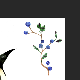
A close up of some little experiments I did. They were quickly done and it was to get my idea's flowing - which makes everything look really productive too. The little berries was an idea stemming from last weeks penguin design because I really enjoyed doing them.

This was to test out some colours for when I finish off my larger piece that I'm trying out in 2D. I will do a separate post for that as it's a result after doing 2 weeks on the design. The colours are nice on the pot, however I don't think I'll be using these exact colours and will probably be using more red tones as appose to orange and a brighter shade of blue (if I decide I'm definitely going to use colour.)

Finally, these are my very delicate leaves behind the snake onesie guy. Gah, I love fine lining leaves. They look so fragile and the leaves can get so intricate and I just generally love the over-all composition of them. I think they look interesting behind tracing paper because they somewhat look frosted.

Experimental with graphic markers, ink & watercolour

1. I experimented with ink and fine liners because fine liners has always been a strength for me, so I figured throw in both something I'm strong at and something I haven't really ever tried before. Here's the result. You can definitely tell which is my strength and which I am new at, however I think it works well. A lot of artists have always combined ink and pen work because the ink typically makes the pen work 'pop', which this definitely did. The only annoying part, is that you have to concentrate so hard on keeping everything neat because it is very easy for the ink to run into the pen work consequently ruining the piece you have done. None the less, I think it worked quite well and it looks really aesthetically pleasing and should definitely be something I try on a much larger scale.


My little veggies. This is technique that Dave suggested; I'd never really thought of the technique as something you can experiment with, but here it is. A lot of water on paper, which then you add ink to very quickly and the differences you can do with colours is really fun because they run into each other and make their own colours and/or run into each other and dry flat and with a line of colour. It's a technique you can really get a finished piece from without using it specifically. My veggies worked well with the technique.
More experimental work with ink/watercolour. Watercolour is interesting because you can work into it with any colour and it blends really nicely. The spider guy I created on the left worked well; I love how the paints sit on the water colour paper and the way the dried so flat. This somewhat creates the feel of what a neo-traditional tattoo does because of the faded yet flat, colour effect. On the right is a bunch of automatic, very quick doodles with water colour and ink.


Heres a little automatic water colour painting I have done. The leaves are my favourite to do with watercolour because the paint can be made lighter or darker and when added onto a dry painting, it dried a lot darker and sits well and creates a darker effect to make the painting less 'flat'. This experiment was to see how well watercolour sits and builds, which definitely worked out in my favour.

Graphic makers are interesting when you've been working with paint, because they work as if you're smudging with water on the shiny side of the sheet. This is the result when working from a reference photo of my tortoise, flower and a pair of antlers. The colours work super well and add shape and form - consequently leave the over-all image looking bright but having shadow. The only thing I dislike greatly, is how working with graphic markers is soo easy to smudge - because you forget that you're working with something that smudges so easily because when it's paint you are aware due to the wet brush.

Finally, this is a very quick automatic sketch using graphic markers before realising that I really just don't want to use them. The little man worked interestingly because I wondered how the bright markers would work with th darker markers. It works, but it is quite unsightly and just isn't my thing. The other doodles really just didn't work very well, leaving me with a negative feeling when using graphic markers.

Wednesday, 16 November 2016

Art Nouveau, Art and Craft + Gustav Klimt

Art Nouveau

Art Nouveau was an international style of art, architecture and applied art which featured decorative designs. The Art Nouveau movement stuck around from 1890 to 1910 and was said to be a reaction to academic art. The art form was known for its decorative nature art forms and featured many artists across Europe. The term "Art Nouveau" stood for "New Art" due to the shift in design and art at the time. The movement featured many art forms within it; everything from architecture, graphic art, interior design and most of the decorative arts at that time. However, later after in 1910, Art Nouveau was replaced with dominant european architecture and decorative styles from Art Deco and then Modernism - which as a consequence Art Nouveau was no longer.

Gustav Klimt
  • Born 1862 and died 1918
  • From Baumgarten, Austrian Empire
  • Part of the symbolism and Art Nouveau movement

'The Kiss' was painted by Gustav Klimt 1907-1908. This is probably his most notorious painting and was painted during the "golden period" of his career; when he did many other paintings in a similar style. The canvas is a perfect square, which on it is a couple engaging in complete love wearing elaborate robes in a typical Art Nouveau style/early Arts and Crafts movement. The painting is composed of oil paint and gold leaves, a style that gives it it's modern yet sophisticated 1900's feel.

Ver Sacrum

Meaning "Sacred Spring" in Latin, was a magazine for the Vienna Secessions, was first published in 1898. It featured drawings and designs in the Jugendstil style. Ver Sacrum was the magazine published on behalf of Vienna Secessions which was a movement involving the conflicting ideas of Klimt.
I like the bold, almost print-working finish of the work in Ver Sacum. It's iconic typography is identifiable immediately as Art Nouveau. I do believe that these have influenced the melodic hardcore/harcore scenes in modern day; because it is holds a very similar finish with one flat base colour and detailing around it or inside it.
This is a design made by an unknown artist for the band Malev. It has a medieval religious feel to it - which is seen a lot throughout the Art Nouveau times. The design has the dark, focal background (primarily around the sides of the illustration) and the feature section rising from the bottom which you can see is typically in the designs for Ver Sacrum.

Ver Sacrum designs were bold and exciting which you can see in a lot of modern designs also. This is my particular favourite that was featured on the cover. This features the typical female form used in Art Nouveau and I think it's interesting because of the strong lifework combined with the flow of the dark, bold background.
William Morris

William Morris was born in 1834 and died in 1896. Morris was wealthy heritiged a textile designer, poet and Novelist who studied at Oxford University, although he was born in Essex.  Morris took an interest in Medievalism whilst studying in Oxford which began his journey for the following years and lead to him owning his own company - "Morris, Marshall and faulknes & Co." He was good friends with the pre-Raphaelite artists Edward Burnard Jones and Dante Rossetti - which shared the love of botanics and has very stylised works. However, Morris' interest in Medieval architecture led him to create a huge project "The Red House" along side his friend Phillip Webb.
THE RED HOUSE


The Red House was a part of the Arts and Crafts movement - which was based in Bexleyheath, South London. It had originally been made for the idea that Morris would live in it with his wife Jane and his future children; however, it didn't result in it. After 5 years of it being build in 1860, Morris discovered he wasn't able to afford the upkeep and sold the property.
The design was highly influenced by Medievalism and the neo-gothic designs that Morris fell in love with. This led Morris to create his company "Morris" for his textile designs (wallpapers) which changed named several times depending on the company he had. However, after the selling of his home, the property later changed interior depending on the residence in the home - losing the traditional medieval and botanic interior that Morris had aimed for. 1866 until 2002, the home was home to various residence by since 2002 the restoration of The Red House went underway by The National Trust who had bought it, to restore the typical Morris original. The home is now able to be visited and has a tea room and gift shop.

James Joyce

James Joyce

  • Born on the February 2nd 1882
  • Published "Portrait of an artist" in 1916 and caught the attention of Ezra Pound
  • Died 1941

James Joyce's Quotes


  • "A man of genius makes no mistakes. His errors are volitional and are the portals of discovery.
  • Better pass boldly into that other world, in the full glory of some passion, than fade and wither dismally with age.
  • Think you're escaping and run into yourself. Longest way round is the shortest way home.
  • Shakespeare is the happy hunting ground of all minds that have lost their balance.
  • Mistakes are the portals of discovery.
  • Your battles inspired me - not the obvious material battles but those that were fought and won behind your forehead.
  • History, Stephen said, is a nightmare from which I am trying to awake.
  • I am tomorrow, or some future day, what I establish today. I am today what I established yesterday or some previous day.
  • Writing in English is the most ingenious torture ever devised for sins committed in previous lives. The English reading public explains the reason why.
  • Christopher Columbus, as everyone knows, is honored by posterity because he was the last to discover America. "

Thursday, 10 November 2016

Penguin Vibes

Beginning with the very last step, here's the final piece that I had created. It is highly inspired (compositionally and the fundamentals) by Katie Scott. I have a good feeling about my work when I have the chance to sit down and really concentrate on one piece - it creates both a sense of achievement and makes me feel positive about my art (which is why; when I continuously just experiment with no outcome every few steps which I consider a good piece; I tend to lose complete interest and faith.) I used the rulers in photoshop which gave my piece the perfect composition due to accuracy. The penguins (now duo) were originally just one. I decided to duplicate them because symmetry, to me, looks greatly appealing. I played around with the composition a few times but ultimately, it was love at first sight. The leaves/berrys and flowers are all also duplicated and flipped vertically. I tried to get the 'natural paper' look that sample art tends to have to carry the theme, even with the background.

The way I created the mushroom was via the initial watercolour that I used throughout the entire of this process and neatened up with photoshop. However, because theres certain parts of the mushroom that were unfinished due to the inability of fine lines on the watercolour (the tests I have done, which should also be on this blog somewhere) led the ink to bleed or scrape at the paint which left an unsightly mess and ruined said pieces. So, I left those parts blank and decided to add the detail as the very last step in the particular illustration.

To do this, I turned down the xp to almost nothing, since this was extremely zoomed in and any bigger would have been too heavy for the illustration composition. The line work was primarily edited with a very low opacity so that, even thought rest of the illustration was mainly done through water colour > photoshop process, it wouldn't look out of place and would completely fit with the illustration itself.

This is the line work once I had completed it. In addition to the opacity and the width of the lines, I also tried to add a little depth too them. To do this is made them all slightly wiggly(?) which slowly led it to look like it had a wave to the design. To add onto that, I decide that I would unsee the layer on photoshop with the line work on it and blend, with the blending too, the colours which I had already placed onto the mushroom via photoshop. This added to the idea of it having depth and made the lifework flow and fit even better with the design.
This is the mushroom once it had been finished. What I decided to do, was to go over the mushroom stalk so that the mushroom would have a HD effect to fit with the other parts of the piece. This was a simple yet complex task since I had to make sure I didn't look the texture behind the additional editing. How I did that, was that I turned the opacity right down and for any darker areas, I turned up the opacity and went over it a few times so it kept the paper behind it. The colours were the original that I had painted, however to create the similarities I grabbed the colour using the colour grabber(?) tool and then turned the colour slightly down or up depending the gradient I wanted at the time. The mushrooms detail on the lid were originally there, but brightened up at the last minute before the over all shadow adding. The shadow's on the mushroom were the very last piece on the mushroom. I turned the opacity right down, I made the brush tool rather large and simple went over the mushroom once on the left, once on the opposite side but up-side-down. This way I could create shadow and depth to the mushroom. The very final step was to clean up the outside of the mushroom.

This was after I had complete almost all the design and was very almost ready to put the design on another file and re-arrange the design. I had finished the mushroom and the penguin, but for some reason I just couldn't figure out why it still didn't look how I wanted. Shortly after, I figured it was because the illustrations were still quite dull and I wasn't completely ready to finish it just yet.


To edit the leaves to look a little less messy that you can see via my sketchbook, I had to carefully chip away at the over-all composition of them. I went around the outsides of the leaves with the brush tool and white (as the background was white) and re-shaped the leaves.

As you can tell, this is the penguin once edited. It is much brighter and a lot higher of a saturation in comparison to the initial one. 

To brighten my over-all image, I decided to use the levels tool, which you can alter the whole image or if you select a certain section, you can selectively edit it. By changing the levels, I made the contrast and saturation brighter creating an over-all brighter, more crisp image.


For the above 3 images, I edited carefully with the pen tool. The over-all image wasn't bright, it wasn't neat and had a lot of imperfections that could be solved by slowly chipping away with a coloured pen tool and altering the colour and saturation using levels and selective colour. Once I found the right colours for certain sections, I could make sure it fit with the composition and  that it was as bright as the rest of the illustration. The blue changed completely because every time I altered the colour, it became purple. 

To make the composition fit, I edited the whole image in photoshop on a new document so that I could play around. To do that, I selected one image at a time, dragged into the new document and played around the placings.

Finally, I ended up flipping and copying the penguins round, because they looked better (personally) compositionally when symmetrical. That way I could do the same to the leaves and leave the centre points being the mushroom and the blueberrys.